Thursday, April 29, 2010

Melinda McDaniel

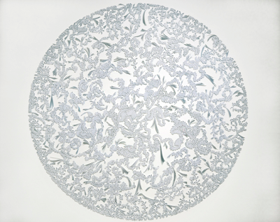
A semester of Intermediate Photography wouldn’t be complete without mention of Melinda McDaniel’s work. Upon checking out her online portfolio, it’s immediately interesting to note that the majority of Mrs. McDaniel’s work includes what might be referred to as photographic sculpture. Aside from her Polaroids from 2010, which feature some bizarre developing techniques producing quasi-landscape likenesses, relatively all of her posted work contains some combination of wood, brads (or other fasteners), and unprocessed photo paper. Furthermore, she places particular attention to the dimension of the photo paper that is seldom explored, the sides. In her 2005 piece, Some Kind of Blue the entire presentation is woven together with strips of unprocessed color photographic paper (stacked together to form three dimensional sections) to create an ornate intertwining. Although these at first may send you back to the white cotton doilies on grandma’s end tables, the methods for which the work was created generates plenty of artistic intrigue. In other words, taking elements of the familiar (most viewers may be familiar with Blue’s linear design, or at least objects of similar linear weaving), but twisting the methods of normal construction.

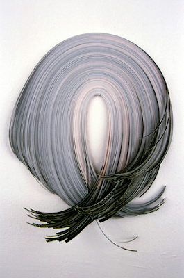
Another piece of particular interest, again implementing her photographic sculpture concept, is Repetitive Self Portrait from 2004. With this piece, Mindy (as with much of her recent work) uses unprocessed color photographic paper. Although the concept behind this particular piece is simple, paper pinned to the wall, the merit again finds purpose through implementation. According to the sculpture’s caption, it uses only C-prints and one pin. As with Blue, the photo paper has been sliced into extremely thin pieces. However, this time it appears that they have been stacked to nearly six to eight inches high. Although the printing on each strip is indecipherable, it can be assumed from the title that several self-portraits were shredded. As a result a double meaning arises as the piece actually contains several pieces of self-portraits and its orientation resembles a human head with the C-prints as hair.

It is interesting to note how Mrs. McDaniel’s work does not fit the stereotypic mold of “photography professor.” After classes depicting the proper film exposure and traditional and contemporary printing practices, it’s amusing to find that Mindy hardly uses any traditional photographic techniques in her recent work. In fact, she seems to purposely seek out the traditions and then break them.

For more info, visit http://www.melindamcdaniel.com/

Jill Greenberg


If you’ve picked up a magazine in the past few years, you may have noticed a particular trend among the covers. Seemingly flawless and metallic skin tone; light that plays with your ability to detect its source; perfect backdrops; vivid color clarity. More than likely the photographer who took those photographs was Jill Greenberg (or someone desperately trying to emulate her style). If you google her name, an array of topics come up discussing her technique, her lighting; essentially tutorials on how to achieve her look. And honestly, I would be guilty of checking those tutorials out. The Jill Greenberg idiom, for those who are interested in commercial photography, has set the modern stage and standard for magazine cover and layout art.

But why? What makes her images so cool? After all, there doesn’t seem to be any underlying meaning behind many of her photographs. In a way, much of her work with celebrities emulates the glamorization of royalty in old paintings. In her portfolio of portraits, we see celebrity after celebrity illustrated in the most convenient of lighting setups where even the most unattractive subject beams with a luminescence that you can’t ignore.

More than anything, most of her work could be classified as character studies. Most subjects are familiar (either celebrities, CEOs, sport stars, and animals) to the majority of her audience but demand an intrigue with her blend of familiarity and fanciful. Moreover, seldom are her subjects dirty. They often come across as advertisements expressing their most perfect qualities. In her set titled, “Monkeys and Apes” all of the animals appear not only clean, but groomed and even made up. One orangutan even has his hair styled in the now seemingly universally fashionable punk mohawk.

In many respects, her work has come to embody the modern commercial conception of cool. However, she does venture outside commercialism. In particular with her, “End Times” depictions of numerous children boohooing, she steps outside the commercial realm to pose a thought-provoking message. She explains that the honesty of children’s emotions demand your attention. Emotions that we as adults have learned to suppress all of our lives.

For more info, visit http://www.manipulator.com/

Wednesday, April 28, 2010

Zoltan Vancso- Unintended Light


"Unintended Light", a project by Zoltan Vancso, deals with Photography's control over the singular moment. In these snapshots of the world, Vancso involves people in and out of shadows (in and out of light) effecting the Unintended light he focus' on as his primary motivation. Many shots involve both of these circumstances, with people in shadows and the other in light (creating their own shadows. In this way Vancso takes the light that is out of his control, and creates moments that are completely in his control. A concept of order, within a realm of chaos. One shot, departs itself from rest, from the idea of unintended light, and that is the shot of Tokyo, Japan. Most noticeably the sky is riddled with artificial, completely intended lights, over a very urban landscape. All of the other shots are situated in rustic towns or cities, and beaches. Places that are far from the metallic modernity of Tokyo. And in this I believe that Vancso wishes to say something about Nature. By placing these artificial lights in complete contradiction with the name of his project, Vancso says many things about humanity. First of which is that it is moving away from Unintended light, away from the natural. In one photo a Boy is standing in the background shirtless, and in the light, while in the foreground two boys stand clothed one with a digital camera, and most importantly in the shadows. Vancso seems to bemoan technology as becoming further and further away from nature which is what he believes is right, since we are a part of nature. In Vancso’s case, chaos is what makes beauty and this is what he is trying to say with “Unintended Light”. The Order of cities and humanity is artificial, contrived, and controlled; where as the Chaos of nature is free of all of those things. In the image of three people in a city illuminated by sunlight, is where Vancso’s main claim can be seen. The people are lit by Natural light, but simultaneously they can be hidden in the shadows of artificial, human construction. In this photo there is a choice that Vancso poses to those who view it, Between the natural, chaotic, and real And the artificial, ordered, and ultimately fake.

Mario Lalich

After stumbling upon Mario Lalich’s website, his tongue-in-cheek approach had an immediate appeal. Sifting through “art” photographer after “art” photographer, finding someone who didn’t center on a sleazy subculture, or arrangements of the nude or morbid was a relief. Instead of bogging the viewer down with the preconceived, over-serious notions of what art should be, Lalich simply presents the familiar with a twist. However, he approaches it as a stand-up comedian would,
taking the elements of the stereotypical familiar (creating a standard expectation) and creating an unexpected punch line. In fact, I found myself chuckling as I perused through his, Portfolio One on his website. One of my personal favorites includes the depiction of a brain exchange between a man and a dog. Apparently the photograph was taken after the exchange. The man (now with the mental capacity of the dog) sits, with a Frankenstein mechanism attached to his head, with the crazed look of a hyper pouch. Meanwhile, the dog sits similarly (now with the mentality of a human) with an expressionless, yet pensive face. Others to note is the cultural clashing image of the Amish on motorcycles, the representation of an astronaut stepping out of an apparent New York City sewer, and the man who has just delivered a child. Which, by the image, seems an everyday occurrence to the doctor and nurses in attendance.

Although much of his portfolio seems on the “art” side of things, his bio reveals that he’s quite the commercial photographer with clientele such as American Airlines and Capitol Records. Furthermore he has had some pretty high profile appearances in the New York Times Magazine and Rolling Stone.

Interestingly, Lalich has recently meandered into the motion picture realm with his 1999 short film, Davenport (Unfortunately his website’s link to this film is inoperative). And currently he has switched gears to a feature length documentary (still a work-in-progress) combining both 16mm film and digital video. Unfortunately, he has delved into the art cliché of the drug underworld for this one.

For more info, visit http://www.mariolalich.com/


Monday, April 26, 2010

Liza Dracup


For my final artist, I found Liza Dracup, a contemporary artist living and working in the North of England. She focuses her photography on the landscapes of the British Isles. The line of work she has currently done is a series of images called Sharpe's Wood. I was immediately fascinated by the color that she captured within each of the images. I then went on to read her profile information and learned that she uses film and vintage medium format camera at night with natural and artificial light and was intrigued that the images weren’t set up. At first they seemed like studio lighting and sets were used, but the sources of light she did use were from “constant waxing and waning of the moon, transient car headlamps and the glow of streetlights”. The images have a painterly quality to each of them, almost as if she used oil to enhance the colors. I also thought the depth of field she created in many of the prints were interesting and gave the image a sort of expressionist movement. The picture I was immediately drawn to is the one presented below. The composition and color are enticing, giving this magical, enchanting feeling about the woods the photographer is entering. It makes the viewer want to keep going but also creates this ominous feeling with the way she creates this warmth in the foreground of the image and cool, dark feeling in the background. She created her images during the period of sun set and sunrise, and she captures that great brilliance of color the sun creates when rising/setting. Her color is vibrant use of color illuminates the bushes and trees surrounding the main focus, which is the path. She even has a use of complementary colors of the bright blue sky and orange bushes which vibrate off of each other. This was the first piece I saw, but after looking through the rest, I found that although they are all on the same subject, they are entirely different from each other and are extremely interesting to look at.

Here is her link: http://www.lizadracup.co.uk/profile.htm

Thursday, April 22, 2010

A New York City Image by Jen Bandini


While researching the artist Annette Messanger for my final project I stumbled upon this contemporary artist. After looking through some of her work, I found this image to be the most enticing. It is 1 of 5 NYC images that she has taken, where she tries to document people in their everyday lives. The illumination coming from the center light creates a silhouette of the two figures in the foreground. The dark that melts down from the background surrounding the lake creates this misty, ominous feeling. The depth of field allows the viewer to see detail in the foreground, creating a smooth and soft texture for the rocks and proceeds back to give us a slight hint of trees and land on the other side of the lake. I really love the sense of cold you get from the hues she picked up within the image. The light is the only thing radiating a sense of warmth within the image, picking up subtle hues of yellow and gold. I especially love how she focuses in on the lake and everything surrounding that main focus is out of focus, especially since the light is the first thing that captures one's attention.
Jen Bandini stated that she is an artist for being a photographer and a painter. She likes to bring a painterly quality to her work and I feel that she did achieve that in this photo. She likes to document people in their everyday lives and that is what she bases her work off of. I find this particular image to be a success and I hope to see her work one day in person.

This is her work: http://jenbandini.com/index.php

Tuesday, April 20, 2010


The artist that I found recently in an art show online was Allison Grant. I found that her work was not only interesting but entirely appropriatefor our final project. In her one portfolio titled Soiled, she creates these scenes of landscapes including mountains, rivers and forests. She likes to take artificial items and make them “coexist” with organic forms. Grant is able to form a mountain scene and what looks to be melted black plastic, she then forms forest scenes with plastic taking up most of the foreground. I think this is a very interesting portfolio and it seems to coincide with her other works. The quality of the photo is also very pleasing and there seems to be great contrast, depth of field and sharpness to her prints. The colors at first seem rather bland, but as you further move into her forest scenes they become rich and vibrant. Although there are no figures in this line, Grant reminds me of previous artists we discussed in class such as, Laurie Simmons and Sandy Skoglund. I really enjoy the textures she used and the different types of material for each of the photographs. I find it interesting and wonder how each item represents the scene for Grant. Unfortunately I was unable to find any comment on the artwork online, but she did talk about her other work and she does try to use items to “overlap harmoniously with nature”. This seems to capture everyday beautiful scenic views and cover them with things we as people in today’s society consider unpleasant. I really found her work appealing and a great reference in trying to figure out my own contorted reality.


Here is the website: http://www.allisongrant.com/

Friday, April 16, 2010

Brandon Voges Upside Down Portraits

When I was searching the internet a while ago I came across a pretty interesting set of work by photographer Brandon Voges. I haven't heard really anything else about Voges' artwork, and even after searching for more information I've only found a little bit more of his photography. None of it really sticks out as much as his upside down portraits which I really think are pretty interesting.


The process that Voges uses for all of his subjects consists of flipping them upside down and hanging them up by their ankles. The detail in his images almost remind me of Jill Greenberg's "crying baby" photos, but these don't look as smooth as those. Regardless of that they are all very detailed shots, and when Voges presents them he shows the photos upside down, which in reality makes them right side up.
All of these shots give off of kind of creepy vibe. I think it's due to the fact that every time you look at them you just get that feeling that somethings not right even though you may not be able to put your finger on it. In the picture I've included in this post you can notice a somewhat odd facial expression on the subject and easily see some signs of the blood rushing to his head. These little clues are easy to pick up on in most of the shots. However, Voges tries to throw you off occasionally by having the subject wear a hat while they are upside down which really makes for a confusing image.
Anyways, I really like the detail in these images as well as the uniformity between them. All of the shots consist of somewhat of an off-white background with a close up on the subject who is placed in the center of the frame. The only real difference you occasionally come across is where the subject is looking. While the majority are looking off to the side there are a few people who are looking straight on at the camera, and this just furthers the creepiness of the images.

You can check out some more photos from Voges' project here and check out this video showing his process.


Thursday, April 15, 2010

Hey guys.....

SO the museum in Albany, downtown, which happens to be also very free, but donations are welcomed, is running an exhibit on photography until May 9th. Its called Seeing Ourselves . It will have images from photographers like Ansel Adams, Eli Reed, Alred Stieglitz and with many categories like America at War and America the Beautiful. It is organized by George Eastman House and its very easy to get to!

the website for it is
www.mysm.nysed.gov/

It should be good!